The Company
Infinite Campus is a Student Information System (SIS) serving over 10 million active student users across the United States. With 1,700+ tools used nationwide, the platform supports teachers and administrators in managing everything from grading and communication to schedules and data reporting at scale.
The Problem
I joined Infinite Campus in June 2024 as part of a three-person UX team supporting 22 development teams across the full product ecosystem of all 1700 distinct tools. At the time, of my joining the product’s UX was inconsistent, accessibility largely unaddressed, and design patterns varied widely, creating friction for both educators using the system and developers maintaining it.
My Role
My work has focused on raising UX maturity organization-wide: from partnering with development teams and championing accessibility, to establishing and socializing research and design standards. The projects that follow highlight how I guided the shift toward a more usable, inclusive, and data-informed product strategy, reducing design debt, improving accessibility compliance, and aligning teams around shared design practices. Below are some of my projects that exemplify my approach to UX Research and Design.
Featured Work
Design System Improvements
Objectives
Solicit feedback on a potential reorganized Design System menu
Identify areas of confusion in organization and terminology
Identify opportunities for education on UX/UI concepts
Tree Testing
Utilized a Figma wireframe simulating a nested navigation menu, intentionally stripped of design and branding to minimize distraction
Conducted iterative testing and refinement
Engaged 26 total participants (12 in Round 1, 14 in Round 2), all active users of the Design System
Participants completed 10 tasks involving locating information relevant to common scenarios at Infinite Campus
Encouraged natural interaction with the prototype as they would with the real Design System
Card Sorting
Informed by insights from Tree Testing
Executed a card sort activity involving 60 participants to further validate and refine menu organization and terminology choices
As part of a multi-step process to improve the UX maturity at the company: I spearheaded an initiative to improve the Design System. After speaking with internal stakeholders and individual contributors. I discovered that the design system was out of date, contained inaccurate information, and, according to users was “impossible to find anything.” My first step was to complete a tree test to better organize the Design System menu. I conducted two rounds of tree testing with internal employees to find out how they would categorize design fundamentals, followed by a card sort activity to finalize the menu organization.
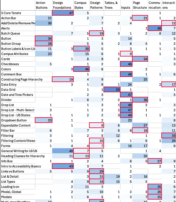
card sort data analysis

Takeaways:
Participants were able to complete the tasks in round 2 significantly better than in round 1 and most noted an improvement from the current state. The card sort analysis showed significant alignment on the topic names with their categories. Participants grouping of the cards aligned with our proposed menu over 83% of the time.
After testing, I shared these results with stakeholders and leadership and offered a plan for next steps. We had learned how users expect to see the design system organized, as well as identified areas of opportunity for internal education to close knowledge gaps. These gaps would be addressed in a series of UX education lessons that I would curate and lead.
Case Study: A Design Solution or a Component Solution?
Intro
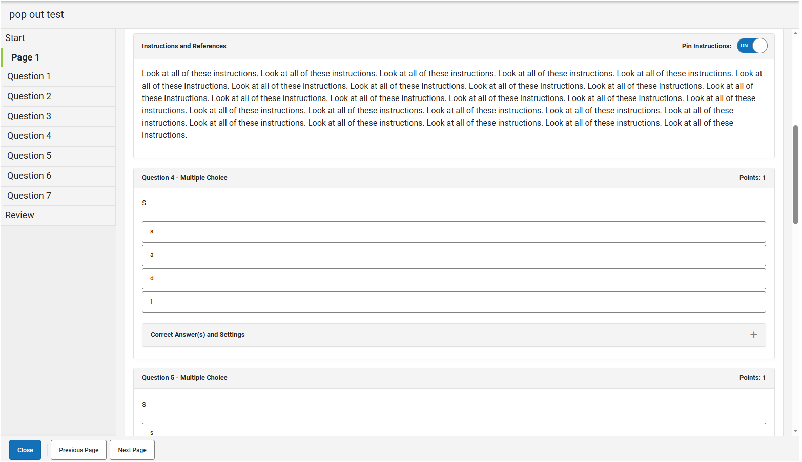
A team wanted to create a component that doesn’t currently exist in our library that would allow users to pop-out a screen element and move it around the screen while the user scrolls through the content. The intention was for quiz instructions, images, or segments of text that the user could reference while completing a quiz or test. This is a feature offered by competitors and the team wanted to offer the same experience for our product.
The Analysis
The team approached me asking how best to implement a new component to fit their needs. The “need” was anchored in a component solution versus a design solution. I encouraged the team to center on the user problem. What does the user need to do in this scenario and why do they need it? In this case, the user doesn’t need a specific component, they need a way to see a portion of the screen while they interact with the rest of the workspace.
The Solution
With the new understanding of the user needs, I recommended using a progressive disclosure pattern that was supported in the design system. Specifically, an option to have the content float at the top of the screen and be collapsible. This would allow the user to access the content as they interacted with the rest of the page but could also easily dismiss and retrieve it as needed.
The Takeaway
It’s important to center the problem statement around the user need. As seen in this situation, this can lead to a simpler, more elegant solution that effectively solves the user problem while meeting the business goals.
Competitor example
Future state solution